CARLSTADT, N.J., September 23, 2016 – Pantone LLC, an X-Rite company and the global authority on color and provider of professional color standards for the design industries, today announced the PANTONE® Fashion Color Report Spring 2017 edition, a comprehensive overview of fashion designers’ use of color in their upcoming collections.
In conjunction with New York Fashion Week, the Spring 2017 PANTONE Fashion Color Report, one of two semi-annual reports published for the fashion industry by the color experts at the Pantone Color Institute, features the top 10 colors in fashion.
“One of the things that we saw this year, was a renewed sense of imagination in which color was appearing in context that was different than the traditional,” said Leatrice Eiseman, Executive Director of the Pantone Color Institute. “Reminiscent of the hues that surround us in nature, our Spring 2017 Fashion Color Report evokes a spectrum of emotion and feeling. From the warmth of sunny days with PANTONE 13-0755 Primrose Yellow to the invigorating feeling of breathing fresh mountain air with PANTONE 18-0107 Kale and the desire to escape to pristine waters with PANTONE 14-4620 Island Paradise, designers applied color in playful, yet thoughtful and precise combinations to fully capture the promises, hope and transformation that we yearn for each Spring.”
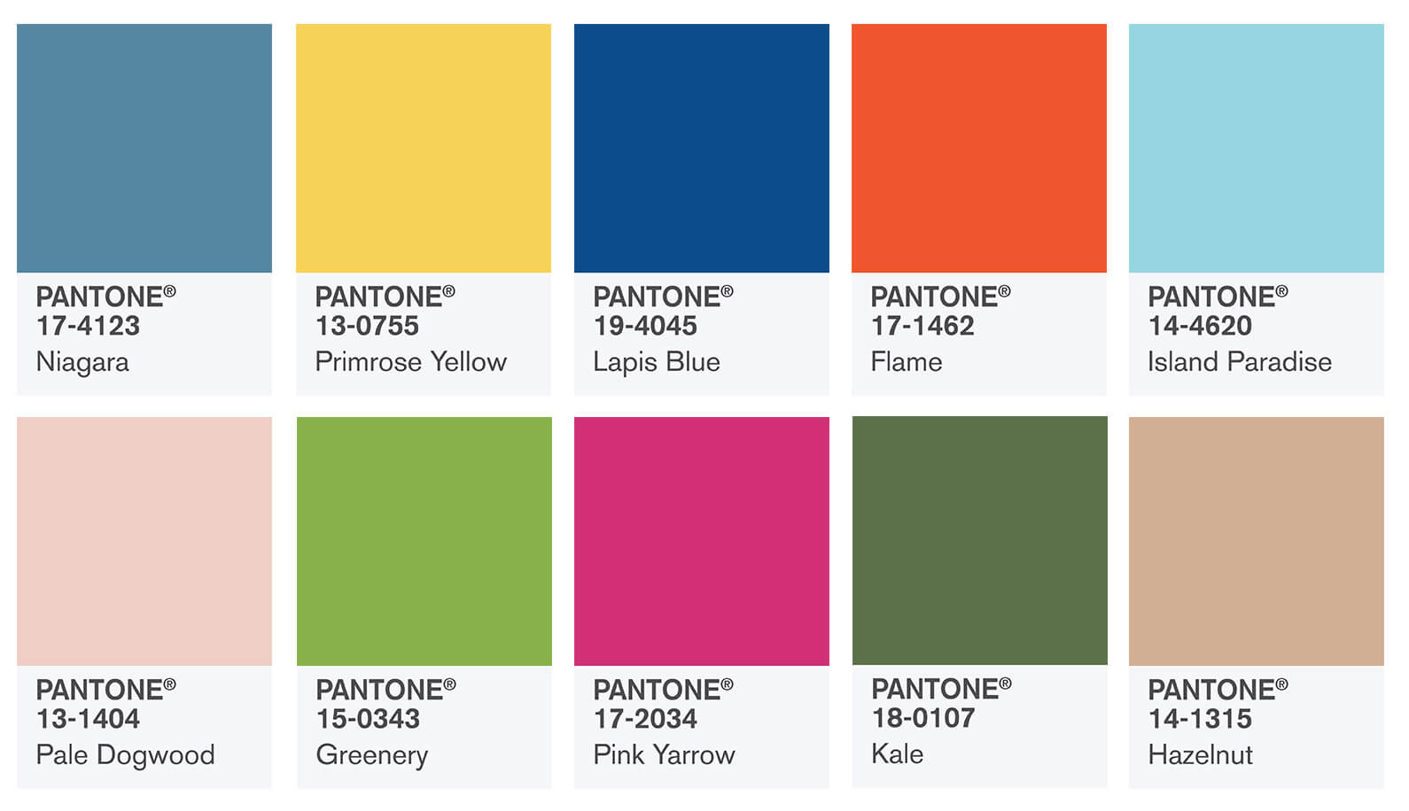
The top colors for Spring 2017 fashion are:
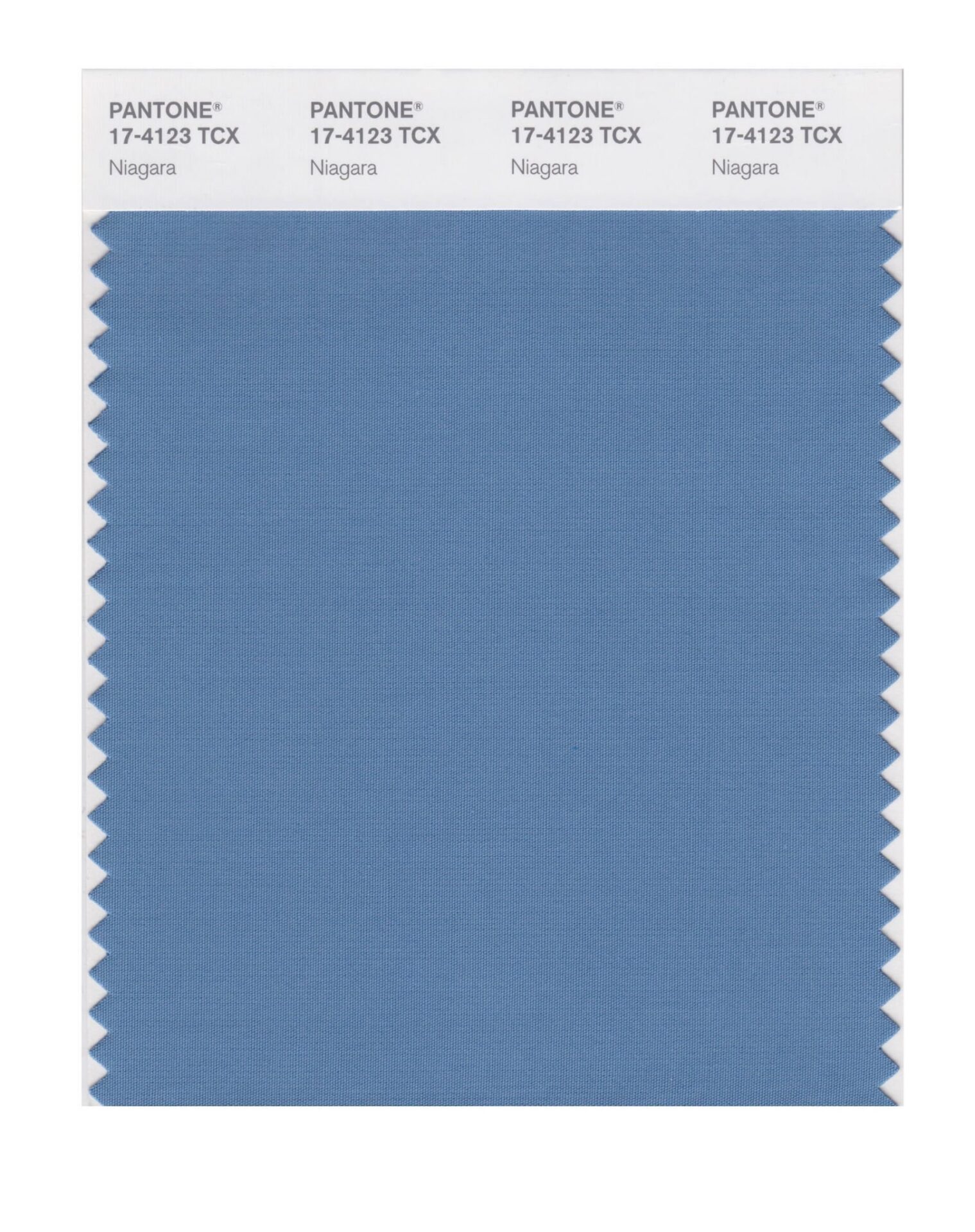
PANTONE 17-4123 Niagara
Comfortable and dependable, Niagara leads the PANTONE Fashion Color Report as the most prevalent color for spring 2017. Niagara is a classic denim-like blue that speaks to our desire for ease and relaxation.
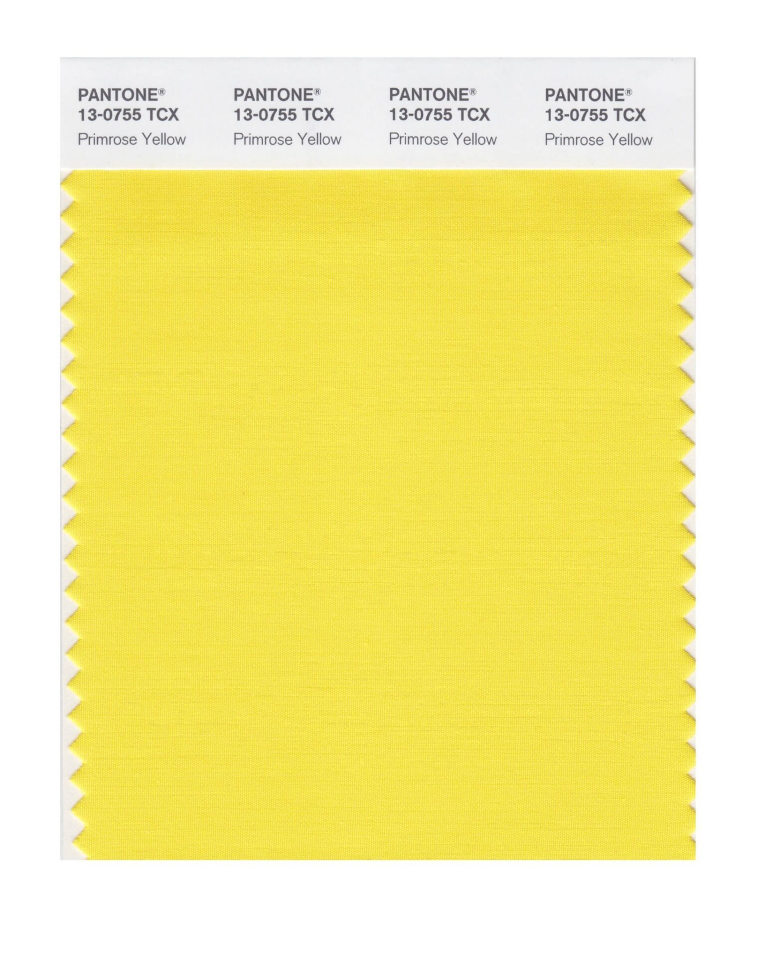
PANTONE 13-0755 Primrose Yellow
By contrast, Primrose Yellow sparkles with heat and vitality. Inviting us into its instant warmth, this joyful yellow shade takes us to a destination marked by enthusiasm, good cheer and sunny days.
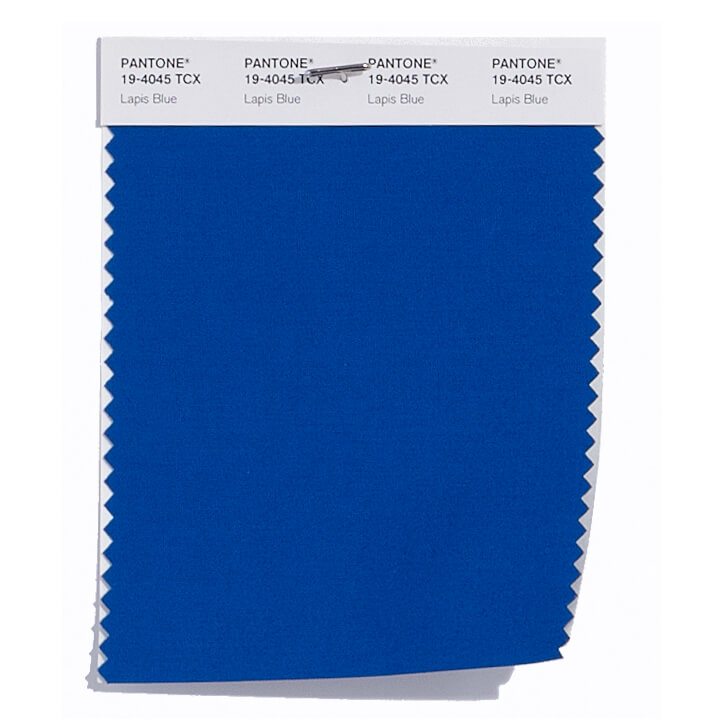
PANTONE 19-4045 Lapis Blue
Conveying even more energy is Lapis Blue. Strong and confident, this intense blue shade is imbued with an inner radiance.
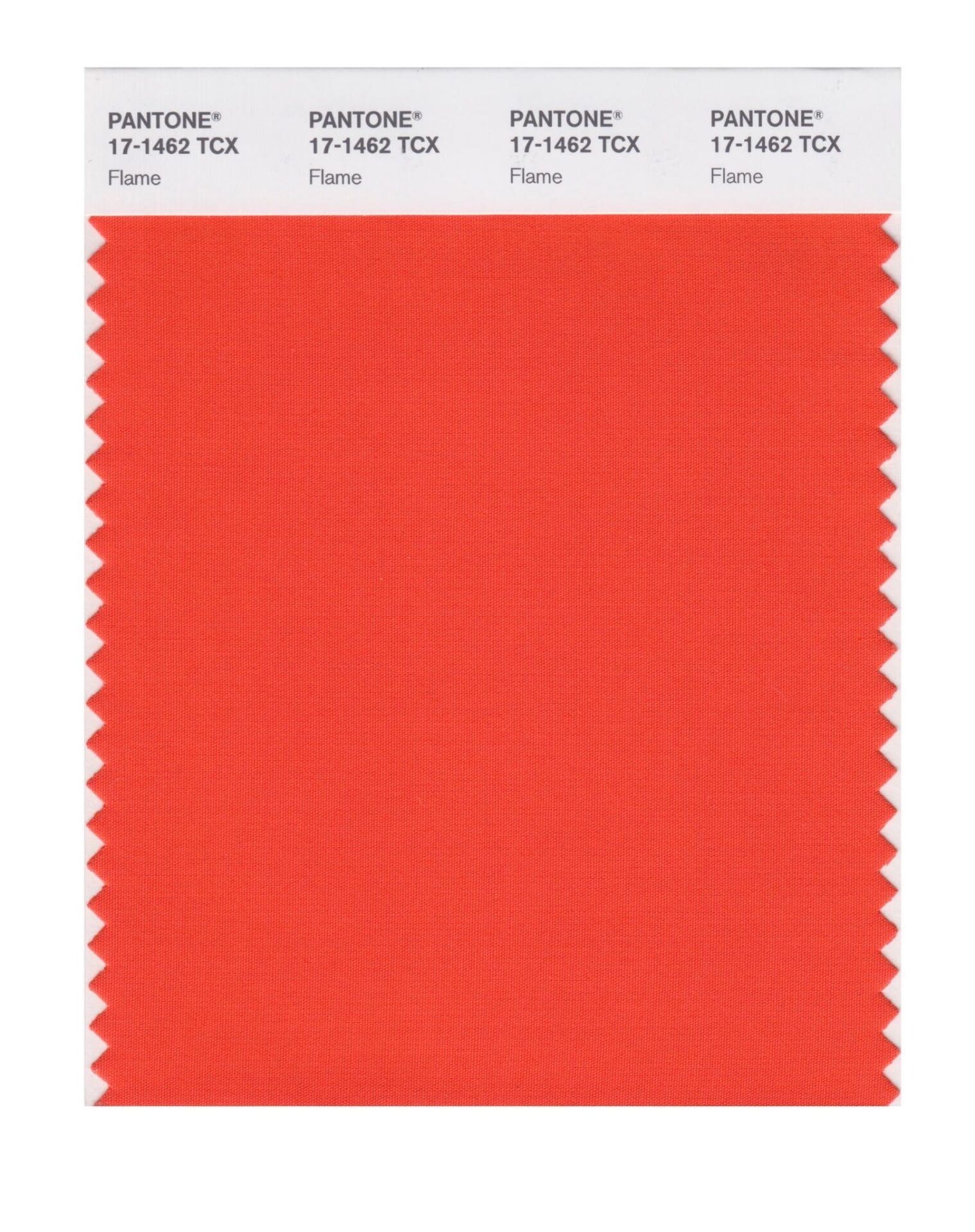
PANTONE 17-1462 Flame
A red-based orange, Flame, is gregarious and fun loving. Flamboyant and vivacious, this wonderfully theatrical shade adds fiery heat to the spring 2017 palette.
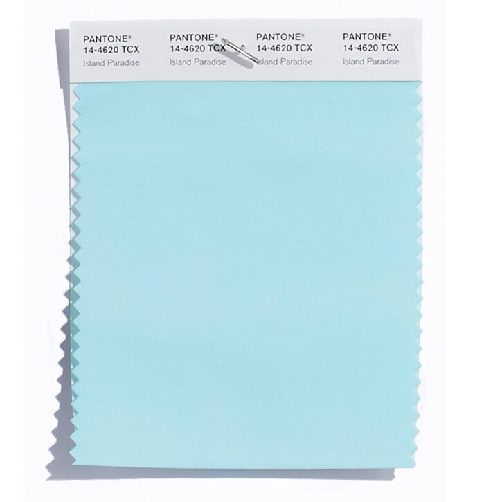
PANTONE 14-4620 Island Paradise
Island Paradise is a refreshing aqua that calls to mind a change of scenery. A cool blue green shade that speaks to our dream of the great escape, Island Paradise is emblematic of tropical settings and our desire to unwind.
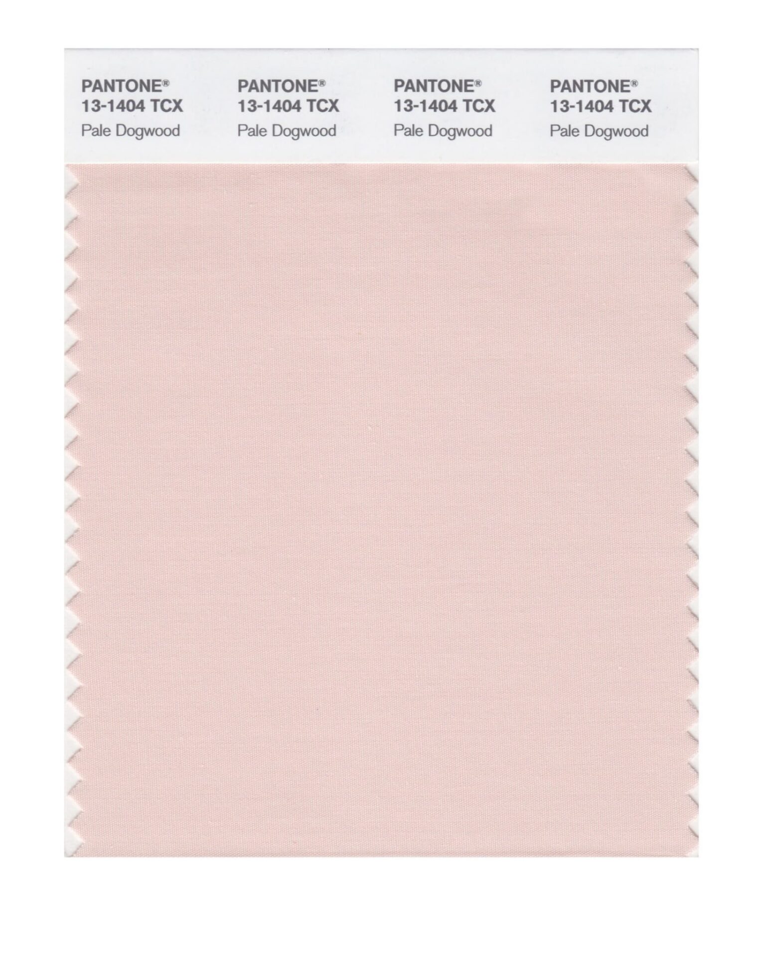
PANTONE 13-1404 Pale Dogwood
Continuing the tranquil mood, Pale Dogwood is a quiet and peaceful pink shade that engenders an aura of innocence and purity. The unobtrusive Pale Dogwood is a subtle pink whose soft touch infuses a healthy glow.
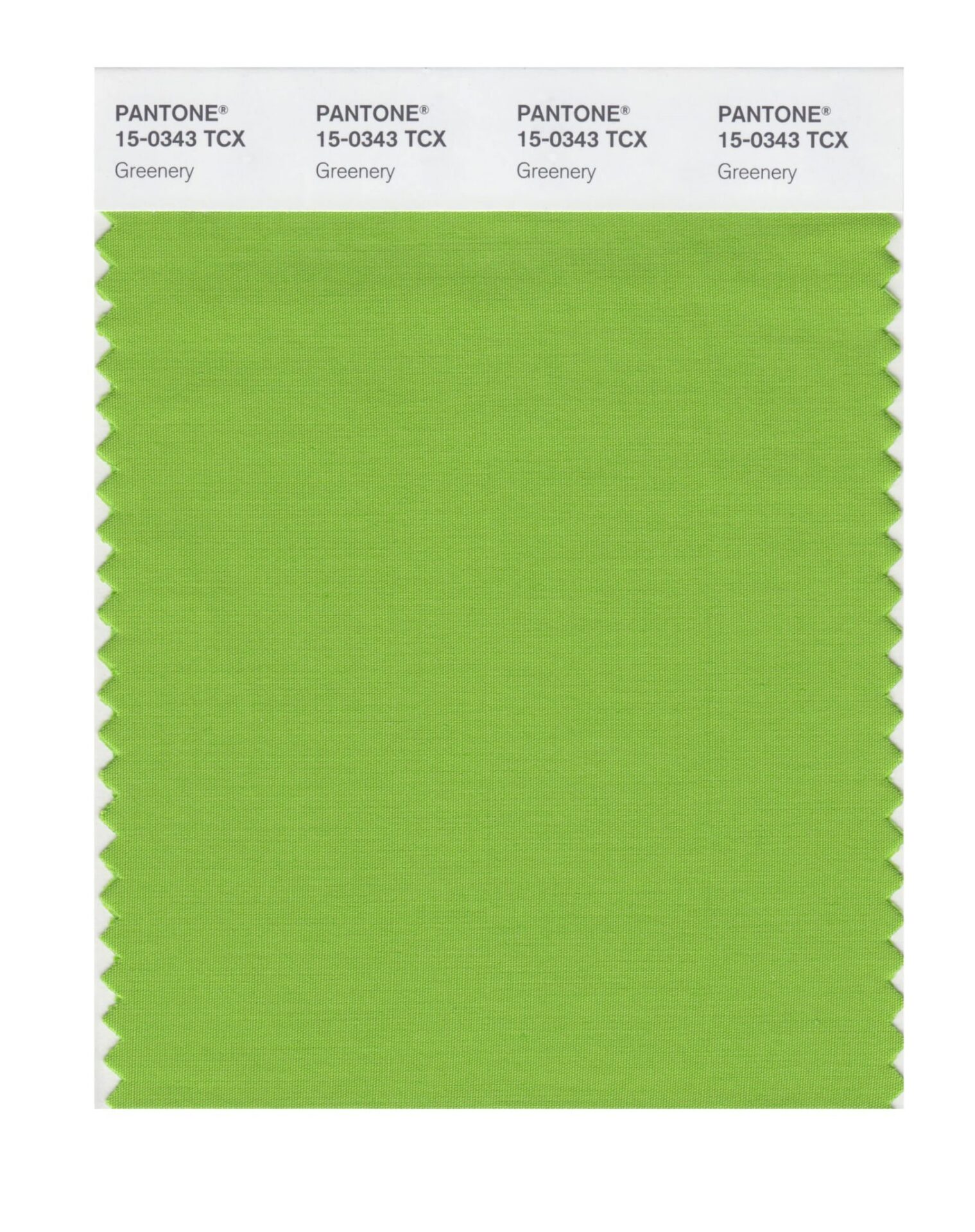
PANTONE 15-0343 Greenery
Bringing forth a refreshing take, Greenery is a tangy yellow-green that speaks to our need to explore, experiment and reinvent. Illustrative of flourishing foliage, the fertile attributes of Greenery signals one to take a deep breath, oxygenate and reinvigorate.
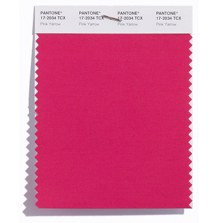
PANTONE 17-2034 Pink Yarrow
Tropical and festive, Pink Yarrow is a whimsical, unignorable hue that tempts and tantalizes. Bold, attention getting and tempestuous, the lively Pink Yarrow is a captivating and stimulating color that lifts spirits and gets the adrenaline going.
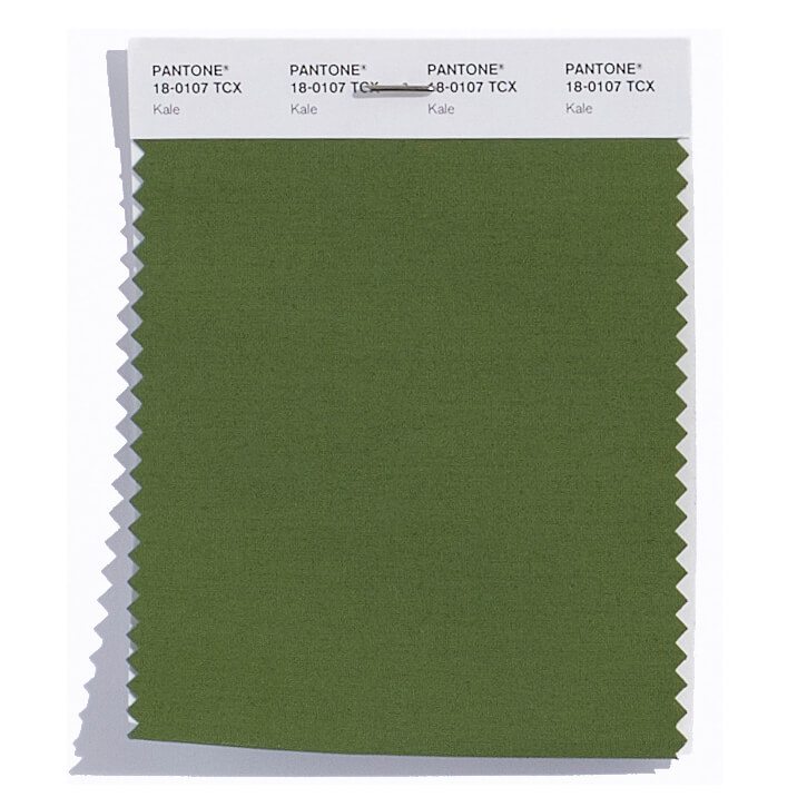
PANTONE 18-0107 Kale
Evocative of the great outdoors and a healthy lifestyle, Kale is another foliage-based green that conjures up our desire to connect to nature, similar to the more vivacious Greenery. And, just as we see in nature, this lush and fertile natural green shade provides the perfect complementary background to the more vibrant tones in the palette.
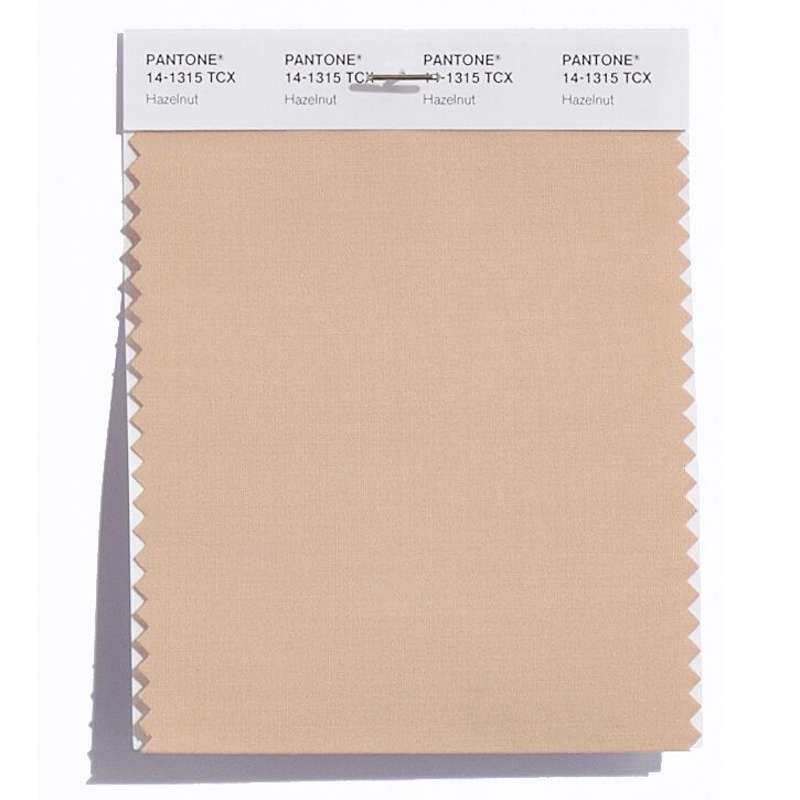
PANTONE 14-1315 Hazelnut
Rounding out the spring 2017 colors is Hazelnut, a key neutral for spring. This shade brings to mind a natural earthiness. Unpretentious and with an inherent warmth, Hazelnut is a transitional color that effortlessly connects the seasons.
The colors featured in the semiannual PANTONE Fashion Color Report are culled from the PANTONE FASHION, HOME + INTERIORS Color System, the most widely used and recognized color standards system for fashion, textile, home and interior design. To compose the report Pantone evaluated color sections by fashion designers showing collections at New York Fashion Week and other global shows to collect information on prominent collection colors, evaluating color trends. This information is used to help create the PANTONE Fashion Color Report, which serves as a reference tool throughout the season for fashion enthusiasts, reporters and retailers.